

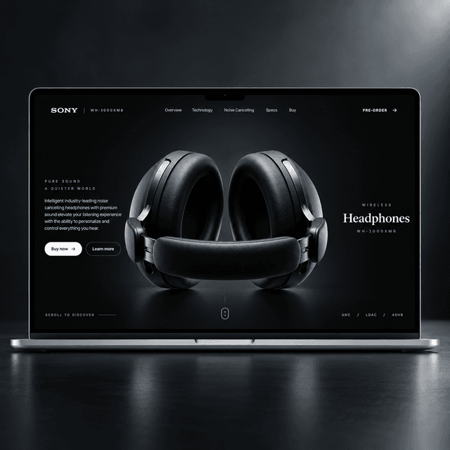
Key Features
Highlights
- •Scroll-scrubbed headphone animations across the hero, design, and hardware sections.
- •Premium, minimalist product UI with responsive navigation and mobile menu.
- •Animated feature, statistic, press, comfort, sound, noise-cancelling, and specification sections.
- •Desktop-first presentation with initial mobile/tablet canvas adjustments.
- •Asset-processing scripts for repeatable image and animation-frame optimization.
Frontend
Sony WH-1000XM6 Product Experience
A high-end, scroll-driven product landing page concept for Sony WH-1000XM6 headphones.
About the project
A high-end, scroll-driven product landing page concept for Sony WH-1000XM6 headphones. The site focuses on an editorial black-and-white visual system, animated product storytelling, feature highlights, specifications, and a responsive buying journey. What still needs improvement The current result is much lighter, but image-sequence animation is still not as efficient as a purpose-built media pipeline. Responsive design status The page is currently optimized and visually polished primarily for desktop. Basic mobile and tablet safeguards exist for canvas sizing and navigation, but those layouts are not yet production-ready. The scroll-driven animation sections, text placement, spacing, and interaction density still need a dedicated mobile and tablet design pass. Next improvements Near-PNG animation quality with a smaller payload: create perceptually lossless, device-sized AVIF/WebP frame variants and serve only the appropriate variant for each screen. This should preserve the visual clarity of the original PNG sequences while avoiding their large transfer cost. Adaptive animation delivery: load an initial frame immediately, then fetch nearby frames as the visitor scrolls instead of decoding every frame at startup. Frame count, resolution, and preload range should adapt to the device, screen density, and connection quality. Fully responsive experience: complete dedicated phone and tablet layouts for every section, including the canvas animations, text overlays, navigation, grids, spacing, and touch interactions. The target is a polished experience from small phones through large desktop displays.